A Bloomberg-style command centre for markets, built to find out how much of that experience a browser can carry.
Open terminal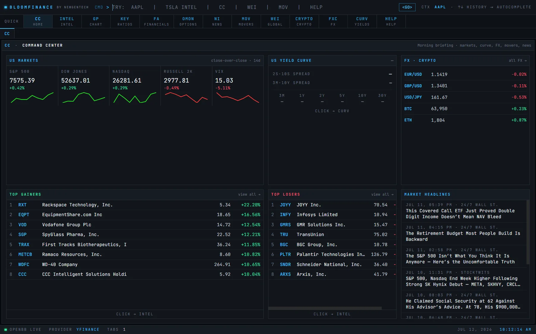
Bloom started as an internal question rather than a product plan. The terminals that professional desks run on are extraordinary pieces of software and almost entirely inaccessible — priced for institutions, keyboard-driven in ways that take months to learn, and locked to hardware. We wanted to know how much of that density and immediacy could survive being rebuilt for a browser, and what would have to be given up.
The answer turned out to be: more than expected, provided you stop treating a market view as a page. Bloom presents live prices, the yield curve, FX and crypto pairs, session movers, and market headlines simultaneously rather than behind navigation. Nothing is more than a glance away, because the entire premise of a terminal is that the user is watching several unrelated things at once and cannot afford to click between them.
The interface is deliberately dark and deliberately dense. That is not an aesthetic preference — it is what the use case demands. Someone scanning a yield curve against FX movement for twenty minutes is served badly by generous whitespace and a light background, and every design decision in Bloom is downstream of assuming a long, attentive session rather than a quick visit.
Decisions worth recording
Simultaneous, not sequential
Every panel renders at once. The moment a market view requires navigation it stops being a terminal and becomes a dashboard, which is a different and much less useful thing. This constraint drove the layout more than anything else.
Dark by requirement
Long-session, high-density reading of numeric data against a light background is genuinely tiring. The palette is a functional decision that happens to look good rather than the reverse.
Data over decoration
There is almost no ornament in the interface. Anything that does not carry information is competing with something that does, and on a screen this dense that competition is expensive.
Why it matters
Bloom is the reference point for how NewGenTech approaches interfaces where the user is working rather than browsing. Most of what we build for financial firms is public-facing and optimised for a first-time visitor, which is a very different problem — but the discipline of designing for density, latency, and sustained attention carries directly into client dashboards and internal tooling.
We design your homepage first.
You only pay if you love it.
No cost and no obligation to start. Tell us about your firm and we will show you what your new site could look like, before a single invoice.
Start the conversation